Pages

Monday, November 9, 2015

A satisfied customer

Recently I did a QGIS scripting job and here is the feedback from an extremly satisfied customer:

It was fantastic to work with Yury. He provided an excellent product, that went far beyond what I was expecting. I will certainly be contacting Yury in the future for any jobs that relate to GIS and python scripting. Communication was excellent and his ability to understand the job requirement was very impressive. A+++

Guys, if you are in need of geoprocessing tool for your project - don't hesitate to contact me ;-) 

Friday, October 23, 2015

My QGIS Processing Scripts at GitHub

This is probably my shortest post ever.

All my QGIS processing scripts (R and Python) and models that I already blogged about, plus some extra are now available at GitHub.

Thursday, June 18, 2015

A Quick Map With QGIS and OSM

What I love about QGIS is that one is able to create a nice map quickly. The other day I was asked to make a situation map for the project we are working on to include it into presentation. Аll I had was a laptop with no relevant spatial data at all, but with QGIS installed (I even had no mouse to draw something). Though it was more than enough: I loaded OSM as a base layer and used annotation tool to add more sense to it. Voilà:


Thursday, June 11, 2015

How to Import Layer into PostGIS Database Using PyQGIS

This is strange, but I was unable to find instruction about importing QGIS layers into PostGIS database with PyQGIS API. The PyQGIS cookbook has the example of exporting layers as .shp-files via QgsVectorFileWriter.writeAsVectorFormat() function and says that the other other OGR-supported formats are available to use in this function as well. PostGIS is supported by OGR so people got confused and try to use this function to import data to the PostGIS with no success and have to write generic import functions. 

After of couple of hours of searching the internet for the solution I gave up and decided to find the answer the hard way: started to search through the source code for the DB Manager plugin that has this nice "import layer" feature. It took about 20 minuets to trace down the function that was in charge of the import and it was QgsVectorLayerImport.importLayer(). But the quest wasn't over yet! The documentation says nothing about provider names that are accepted by this function. "PostgreSQL" would be the obvious name for the provider as it is the name for the PostgeSQL provider in OGR, but it is not the case. I had to go through the source code of DB Manager again and luckily in comments (and there are quite a few of them in DB Manager: I didn't find a single doc-string there) the author wrote that it is "postgres" for the PostgreSQL. UPD: the function to list available providers is QgsProviderRegistry.instance().providerList().

Now here is the very basic example code of importing QGIS layer into PostGIS:


uri = "dbname='test' host=localhost port=5432 user='user' password='password' key=gid type=POINT table=\"public\".\"test\" (geom) sql="
crs = None
# layer - QGIS vector layer
error = QgsVectorLayerImport.importLayer(layer, uri, "postgres", crs, False, False)
if error[0] != 0:
    iface.messageBar().pushMessage(u'Error', error[1], QgsMessageBar.CRITICAL, 5)

Wednesday, April 1, 2015

A Note About a "#IND"-Error in OfreoToolbox Classification Algorithms

One of the optional input for the creation of the classification models in OrfeoToolbox is XML image statistic file that is produced by Compute Image Second Order Statistics tool. If you opt to calculate this statistics - necessarily check the created XML file. If you will see "#INF" record in band statistics (i.e. "1.#INF") - replace "#INF" with something like "0e+32" ("1.#INF" -> "1.0e+32"), or (a better solution) - calculate the statistics for this problematic band independently (probably with another tool) and completely replace the value. 

If you leave "#INF" record in XML file, models for classification that will be created based on it will have "#IND" records and when you will try to run classification based upon these models - the process will be terminated complaining about unrecognised "#IND"-values, because values must be numeric and not characters.

I don't know what causes the "#INF" records to appear in the first place, maybe not properly defined no-data values? In some cased it is impossible to provide correct no-data value due to limitations of the input field (I use OTB from within Processing module for QGIS). 

Thursday, March 26, 2015

Why are natural environments often degraded in the name of economic progress even when this invites disaster, and how can this be overcome?

This was one of discussion questions of the Disasters and Ecosystems MOOC.

Actually the answer is simple. The formula for successful environmental degradation consists of 2 variables - overpopulation and capitalism.

When there are a lot of people - most of them a poor, uneducated and hungry. When you are hungry you will do everything to become less hungry today even if it can potentially lead to negative consequences tomorrow, which you may not even foresee if you are uneducated.

Humans are good in adaptation. When the adaptation is strong enough it leads to abuse (for example, if you are well adopted at the stock market you start abusing it to increase your profit even if it will cost dearly to the other stakeholders - people value their own well-being much more than the other's and of course much more than the well-being of environment especially when they know that their own impact seems negligible compared to impact of the entire population).  When you live in condition of free market of capitalistic world - you are your only hope for not being hungry (or being more wealthy) now. And as you know from the economic theory - the capitalist economy needs a constant grows of consumption and production - so you need more and more resources to just sustain the economy. In conditions of capitalist market people value today's profit much more than losses of tomorrow.

You see - the capitalist economy needs people to consume more and more; more people - more consumption; more people - more poverty and lack of education; more hungry uneducated people people - more people willing to do anything to survive now and don't even bother themselves about the future.

Overpopulation and a consumption society (created by capitalist economy) inter-stimulate each other and destroy the environment for the today's profits or food and doesn't care much of the consequences of tomorrow because most are either uneducated or doesn't care at all plus you have to live through today to face consequences of your actions tomorrow (a day-by-day living).

Obviously there are 3 steps to improve the situation:
  • Decrease the population.
  • Educate people.
  • Create new sustainable economy model that would equally value tomorrow's losses and today's profits, and would not rely on constantly increasing consumption.

Sunday, February 8, 2015

Pan-sharpening Using R

In my previous post I described how to perform pan-sharpening using OrfeoToolbox and QGIS. This time I will show you how to do this in R. At the bottom you will find several functions I wrote on top of the 'raster' package that allow a convenient pan-sharpening in R.

Motivation

You may wonder why I even bothered myself with pan-sharpening in R when I already have a nice model for pan-sharpening in QGIS. See, one can't control the data-type of the imagery returned by pan-sharpening that involves OTB. This leads to some unpleasant consequences: during pan-sharpening one will get floating point pixel values even if in initial values were integers. So for example a 600 MiB multi-spectral imagery (with integer pixel values) after pan-sharpening will grow to 5.2 GB. But if we will change datatype of the resulting imagery to force it store only integers it size will be reduced from 5.2 to 2.8 GB which is a huge difference. 'raster' package in R allows to control output datatype. Plus using R you can play with different filtering options to play with.

The Theory

In OTB pan-sharpening is performed using following well-known formula:


Where and are pixels indices, PAN is the panchromatic image, XS is the multi-spectral image and PANsmooth is the panchromatic image smoothed with a kernel to fit the multi-spectral image scale.

We will implement exact the same approach using 'raster' package for R.


Code Usage and Result

As pan-sharpening is the type of procedure that will reoccur over some time I decided to write generic functions for pan-sharpening itself and for saving the results to have easier time in future.

The usage is as simple as:

pan <- raster('pan.tif')
multi <- brick('multi.tif')
pansharp <- processingPansharp(pan, multi)
output_path <- 'path_and_filename_without_extention'
saveResult(pansharp, output_path)

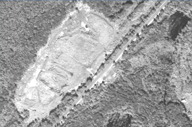
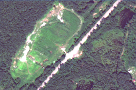
Here you are the example results from the script and from the OTB model for one of the illegal landfills in Russia:

Initial multi-band raster

Initial panchromatic raster

Result of pan-sharpening using R script

Result of pan-sharpening using OTB


Which output do you like better: from OTB or R? Comparing both output results you can notice that the output from R bears heavier filtering markings than the one from OTB. On the other hand R output has more hues of the green colours which actually helps in distinguishing different types of vegetation. As you will see in the code - one can easily adjust or modify procedure of filtering panchromatic raster (extractLPF() function) in order to get desired output.

The code

library(raster)


# Create needed functions -------------------------------------------------

pansharpFun <- function(raster){
    '
    This function pansharpens a raster
    ' 
    # @param raster - Raster object with 3 bands (to-be-pansharpened, high-res and low-frequency component of the high-res image)
    # @param band - band numver, integer
    # @return pansharpened_raster - pansharpened Raster object
    # pansharp = Lowres * Highres / LPF[Highres]
    
    pansharpened_raster <- (raster[,1] * raster[,2]) / raster[,3]
}

extractLPF <- function(pan, multi, filter = 'auto', fun = mean) {
    '
    Returns a low-frequency component of the high-resolution raster by the
        filter adjusted to the low-resolution raster
    '
    # @param pan - a high-resolution panchromatic raster - Raster object
    # @param multi - low-resolution raster to be pansharpened - Raster object
    # @param filter - a smoothing wondow - matrix
    # @param fun - a function to process filter (part of the focal() function)
    # @return LPF - a low-frequency component of the high-resolution raster - Raster object
    
    # Adjust filter size 
    if (filter == 'auto') {
        pan_res <- res(pan) # (x, y) resolution of the panchromatic raster in CRS units (?)
        multi_res <- res(multi) # (x, y) resolution of the lowres raster in CRS units (?)
        x_res_ratio <- round(multi_res[1]/pan_res[1])
        y_res_ratio <- round(multi_res[2]/pan_res[2])
        total <- x_res_ratio + y_res_ratio
        filter <- matrix(1, nc = x_res_ratio, nr = y_res_ratio)
        
        # Enshure that the matrix has an uneven number of colums and rows (needed by focal())
        if (nrow(filter)%%2 == 0) {
            filter <- rbind(filter, 0)
        } 
        if (ncol(filter)%%2 == 0) {
            filter <- cbind(filter, 0)
        }
        
    LPF <- focal(pan, w = filter, fun = fun) # low-frequency component
    
}  


processingPansharp <- function(pan, multi, filter = 'auto', fun = mean){
    ' 
    Pansharpening routine
    '
    # @param pan - a high-resolution panchromatic raster - Raster object
    # @param multi - low-resolution raster to be pansharpened - Raster object
    # @param filter - a smoothing wondow - matrix
    # @param fun - a function to process filter (part of the focal() function)
    # @return pansharp - pansharpened 'multi' raster - Raster object

    # Check if input parameters are valid - we can loose a lot of time if some of the inputs is wrong
      
    LPF <- extractLPF(pan, multi, filter, fun)
        
    multi <- resample(multi, pan) # resample low-resolution image to match high-res one
        
    all <- stack(multi, pan, LPF)
    
    bands <- nbands(multi)
    pan_band <- bands + 1
    lpf_band <- bands + 2
    
    # Pansharpen layers from low-resolution raster one by one
    pansharp_bands <- list()
    for (band in 1:bands) {
        subset <- all[[c(band, pan_band, lpf_band)]]
        raster <- calc(subset, pansharpFun)
        pansharp_bands[[band]] <- raster
    }
    
    pansharp <- stack(pansharp_bands)
}

saveResult <- function(raster, path, format = 'GTiff', datatype = 'INT2S'){
    '
    Saves Raster object to location
    '
    # @param raster - raster to be saved - Raser object
    # @param path - path including filename without extention - string
    # @param format - format of the output raster accordingly to writeRaster() function - string
    # @param datatype - datatype of the raster accordingly to writeRaster() - string
    
    writeRaster(raster, 
                path, 
                format = format, 
                datatype = datatype, 
                overwrite = T)
}


# Do pansharpening --------------------------------------------------------


pan <- raster('pan.tif')
multi <- brick('multi.tif')
pansharp <- processingPansharp(pan, multi)
output_path <- 'r_pansharp-new' # includes path and filename but not the extention
saveResult(pansharp, output_path)

Saturday, January 31, 2015

Pansharpening in QGIS Using QTB

UPD: also you may want to check out my post on Pansharpening using R.

For a long time I wanted to play with the OrfeoToolBox instruments (and its GUI named Monteverdi) - a set of powerfull tools to process remote-sensing imagery. Finally I got the opportunity - I needed to perform pansharpening of the World-View-2 scene and I decided to make it using OTB modules available via QGIS Processing toolbox.

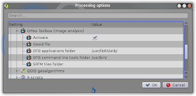
To make OTB modules available in QGIS you need to install it on your system. Official site provides good instructions on how to do it. When you have OTB installed you need to enable it in QGIS. Go Processing -> Options and configuration -> Providers, activate OTB and provide folder information if needed:

A dialogue to enable OTB modules in QGIS

Pansharpening is made in two steps: 1) resampling of the low resolution raster via Superimpose sensor tool; 2) pansharpening using Pansharpening tool. Alternatively you can do it using one command line (no QGIS or other GUI needed) in your OS's console: 
otbcli_BundleToPerfectSensor -inp pan_image -inxs xs_image -out output_image.  
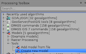
Performing two steps instead of just one is super-boring! Lets create a model that will allow us to perform pansharpening in QGIS in one step (virtually). Go to Processing Toolbox -> Models -> Tools and start creating new model:

Processing toolbox location of 'Create new model tool'

In the model creation window fill the fields of the model name and group name. Then add two rasters as inputs and name them: High_resolution_panchrom_raster and Low_resolution_raster. Now add the module named Superimpose sensor (Orfeo Toolbox -> Geomentry -> Superimpose sensor) and configure it to resample the Low_resolution raster: use High_resolution_panchrom_raster as input in Reference input field and Low_resolution_raster as input in The image to reproject field. 

Superimpose sensor dialogue window

Add Pansharpening (rsc) (Orfeo Toolbox -> Geomentry -> Superimpose sensor) module to model. Use High_resolution_panchrom_raster as input in the Input PAN Image and output of the Superimpose sensor as the input in the Input XS Image field. Give a name (pansharpened_OTB) for the Output image to let model know that this is the final stage of the processing.
Pansharpening (rsc) dialogue window

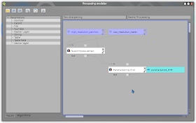
Here how our model looks like in Model builder:
Overview of the Pan-sharpening model in model builder

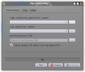
And this is how it looks like when you launch it:
Pan-sharpening model window

Also you can skip model creation process and just download model that I created. You need to paste files from archive's models folder into your /.qgis2/processing/models directory.

If you will have issues running OTB Pansharpening it is likely that they will be covered in following gis.stackexchange topics: OTB Pansharpening Error: Adapter for adaptPansharpening-bayes not found and What causes OTB pansharpening ERROR: Inputs do not occupy the same physical space? 

Thursday, January 29, 2015

A Dialogue With Bot

Back in the days when ICQ was popular spam bots added you to their contact lists dozens times a day. But they were brute and ugly. At first they spew their spam links at your face when you added them, then they simply started to insert spam links in the body of the invitation. ICQ is long dead and spam-bots never bothered me in modern protocols... until some time ago.

Monday, January 19, 2015

How to Predict Where Will Next Disaster Strike?

It is amusing coincidence that another MOOC that I took this week (Geospatial Intelligence & the Geospatial revolution) mentioned [natural] disasters. About the other course see my recent Disasters: Myth or the Reality post.

In Geospatial Intelligence they gave a weird assignment: one need to mark the location on the world map where the next international natural disaster will occur O_o. This is not and easy task by any means and the lecturer suggested to use one's 'gut feeling' if one's knowledge is insufficient (I suppose it is close to impossible to find someone who can make such a prediction taking into account all the types of the disasters). Though the link to the International Disasters Database was given, so I accepted the challenge (to make a data-driven prediction). To predict the exact location of the next disaster one would need a lot of data - far more that you can get out of that database so my goal was to make prediction at the country level. (BTW the graphs from my post about disasters seems to be based on the data from this database - I saw one of them at that site)

I passed a query to the database and saved the output to process it with R. The dataframe looks like this:

year | country | continent | occurrence | deaths | injured | homeless | total_affected | total_damage
Example of disasters dataset
So how to predict the country with the next disaster? I came up with the idea to calculate cumulative average occurrence of disasters per country per year and plot it on the graph to see the trends. If I would just calculate average occurrence of disasters per country for the whole time of the observations I would have significant issues choosing from countries that would have close numbers. Plus the total average disasters per year can be misleading by itself due to it can be high because of high amount of disasters in the beginning of XX century but relatively low number in XXI.  

The formula for the calculation of the cumulative average for the given year that I used was:
Cumulative_Average = Total_Occurences / ( Given_Year - (Starting_Year - 1) ) ,
where: Total_Occurrences is the sum of occurrences of disasters for given country in time interval between the starting year and the given year (inclusive).

Here is the plot I got for the short-list countries (plotting the results for all the 180 countries from the dataset makes plot unreadable):
Cumulative average is growing rapidly since 1970s for Indonesia and China
Cumulative average number of disasters

It is clear that China and Indonesia are the two most likely candidates for the next disaster to strike, with a China having a lead. I'm not ready to provide insight on the reasons of the increasing number of natural disasters in the countries at the plot now (especially for Turkey and Iran). Maybe it is just that the events become documented more often?... It should be investigated further.

The code

Here is the code to create the plot above. 'sqldf' package was really helpful for divide data for the short list countries from the rest of 180 countries.

library(ggplot2)
library(sqldf)
library(grid)
#library(gridExtra)


# Load natural disasters data ---------------------------------------------

dis <- read.csv("~/R/Disasters/Natural_disasters.csv")

# Create data frame with average number of disasters per year -------------

average_events <- data.frame(country = character(),
                             year = numeric(),
                             disasters_per_year = numeric(),
                             stringsAsFactors = F)

countries <- unique(dis$country)

starting_year <- min(dis$year) - 1 # we subtract 1 year to have numbers greater than 0 further on

for (country in countries) {
    data <- dis[dis$country == country,] # we need data for one country at a time
    disasters_count <- 0
    years <- unique(data$year)
    
    for (year in years) {
        total_years <- year - starting_year 
        y_data <- data[data$year == year,]
        n_disasters <- sum(y_data$occurrence)
        disasters_count <- disasters_count + n_disasters
        average_disasters <- disasters_count / total_years
        row <- data.frame(country = country, year = year, disasters_per_year = average_disasters)
        average_events <- rbind(average_events, row)
    }
    
}


# Plot data about average number of disasters per country per year --------


# Data for 180 countries is hard to plot, lets filter mots affected.
# Let's use SQL to query data: subset data for countries that had more than 0.6 disasters per year
# in any year after 2000
danger <- sqldf('SELECT * FROM average_events WHERE country IN 
      (SELECT DISTINCT country FROM average_events WHERE disasters_per_year >= 0.6 AND year > 2000)')

p <- ggplot(danger, aes (x = year, y = disasters_per_year)) + 
            geom_line(size = 1.2, aes(colour = country,  linetype = country)) +
            labs(title = 'Cumulative average number of disasters per year',
                 x = 'Year',
                 y = 'Average number of disasters cumulative') +
            guides(guide_legend(keywidth = 3, keyheight = 1)) +
            theme(axis.text.x = element_text(angle=0, hjust = NULL),
                  axis.title = element_text(face = 'bold', size = 14),
                  title = element_text(face = 'bold', size = 16),
                  legend.position = 'right',
                  legend.title = element_blank(),
                  legend.text = element_text(size = 12),
                  legend.key.width = unit(1.5, 'cm'),
                  legend.key.height = unit(1, 'cm'))
           
plot(p)

Saturday, January 17, 2015

Disasters: Myth or the Reality?

I enrolled a MOOC titled "Disasters and Ecosystems: Resilience in a Changing Climate" which is organised by the UNEP (and other organisations... which names I'm going to learn by heart cause they have like 2 minutes of credits after each lecture O_o ). Not that I know nothing about disasters, risks or climate change (I'm a geographer and ecologist after all), but I was curious about the product that was made by organisation of this class.

The third video (and first video that is not an introduction) they teach us about the disasters; differences between hazard and disaster; and risks. Well... the thing they told, the graphs they showed - that what inspired the title of this post.

Terminology

Here see some definitions they use.

DisasterWhen they say "disaster" they mean "natural disaster" that was enhanced by human [mismanagement].

Risk - a potential losses due to disasters.

Hazard - A dangerous phenomenon, substance, human activity or condition that may cause loss of life, injury or other health impacts, property damage, loss of livelihoods and services, social and economic disruption, or environmental damage.

Exposure - People, property, systems, or other elements present in hazard zones that are thereby subject to potential losses.

Vulnerability - the characteristics and circumstances of a community, system or asset that make it susceptible to the damaging effects of a hazard

Fails

The risk

They presented a "great" formula for (a disaster) risk evaluation that they use in the UN:
Risk = Hazard * Exposure * Vulnerability
where: Exposure = People * ExposureTime
Vulnarability - succeptability to hazard.
Well these characteristics do correspond to the risk, but the formula is stupid! I already wrote about that: Risk = Probability * Damage. And this formula actually corresponds to the definition they give (see Terminology section). We can't get a monetary outcome from their formula. We can't get numeric numeric output out of that formula at all: can you multiply flood by people? Can you???!!!

A Disaster with Disasters

The fail with the risk evaluation is a common mistake, but the fail with disaster - that is what really cool!

Take a look at this plot (which is from reading materials from the course):
What can you conclude from this plot? That the world is doing to hell and we all will fall to disaster? Let's look closer. The exposure is growing faster for poorer countries (and it is the only conclusion they make in lecture)... but the total number of people exposed (and for each type of countries) seems to be the almost unchanged! Interesting... This means (see the definition for the exposure) that there are just a 150% increase of property value in the dangerous area of the poorer countries (and 25% for the richest) on a span of 30 years. Does this graph shows us only the economic grows? I think it does... (reminds me of my previous post).

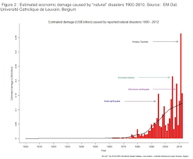
Now to the most delicious part. Take a look at this two graphs from the lecture readings:
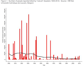
Deaths dynamics


Damage dynamics

This is interesting. Despite the population growth and all that questionable "climate change" staff people die less (in total numbers), see fig. 1, but the damage increases, see fig. 2. Did they take inflation into account for the damage graph? Do not know... I think they didn't, otherwise they would use "discounted damage" term instead of just "damage" and would indicate the base year. So the second graph seems to demonstrate inflation and may be the economic grows.

Clearly disasters are not that disastrous. Despite the new on the TV on the subject the nature's wrath even enhanced by human is less and less dangerous for human lives. The pockets are to suffer: the storm in port wrecking the humble fisherman's boat or a trawler - that's the difference.


Conclusion

From these graphs I can conclude one thing - it is safer to live now than in the past, a disaster should not be feared as a deadly havoc. To my mind the disaster nowadays is entirely economic issue. See, if we loose less people and (maybe) more money - we should just develop more advanced insurance techniques to cover economic damage and relax. The disasters should just be studied as phenomena to develop cheap early warning systems, let the property be destroyed (just cover the losses with insurance) and additional employment to be created (rebuilding).

This is my conclusion form the graphs I showed here: disasters are an ancient myth! Just buy insurance! LOL

Saturday, January 10, 2015

Do You Know What You Show at Your Map?

As access to the GIS and mapping is becoming easier every year the more people and companies create maps. Unfortunately often they just do not know what they are actually showing at their maps. This issue is being mentioned over and over again.  

Here is the example that I discovered recently: Cyberthreat Real-Time Map by Kaspersky antivirus company. Here how it looks like:


Amongst the other info they show the Infection rank for each country... based on total threats detected.... You may have already guessed what is the fail, but I let me explain it anyway.

See, the №1 infected country is Russia, which is the home country for Kaspersky and where this antivirus is quite popular. So we can conclude that the rankings that supposed to demonstrate the severity of virus activities merely demonstrates the number of Kaspersky software installations across the globe.

Lets test this hypothesis. I don't have the data about the number of installation of Kaspersky software per country, but it is safe to assume that this number is proportional to the population of the given country. Also it is easier to get infection rankings for countries from the map than the number of the threats detected. If I had total threats data per country I would compare it to the population. Having infection rankings it is more rational to compare it to the population rankings instead. So I picked 27 random countries and compared their infection and population rankings. The result is demonstrated at the plot below:

Infection rank vs. Population rank
The linear model is fairly close to Inrection rank = Population rank. It is clear that the phenomena that is presented as an Infection rank just reflects a total software installations per country and not the severity of the 'cyberthreat'. In order to get the actual Infection rank the number of detected threats have to be normalised by the number of software installations.