What is the cause for the degradation of environment?
Capitalism, corruption, consuming society? - OVERPOPULATION!
Please, save the Planet - kill yourself...

Showing posts with label spatial data. Show all posts

Sunday, February 8, 2015

Pan-sharpening Using R

In my previous post I described how to perform pan-sharpening using OrfeoToolbox and QGIS. This time I will show you how to do this in R. At the bottom you will find several functions I wrote on top of the 'raster' package that allow a convenient pan-sharpening in R.

Motivation

You may wonder why I even bothered myself with pan-sharpening in R when I already have a nice model for pan-sharpening in QGIS. See, one can't control the data-type of the imagery returned by pan-sharpening that involves OTB. This leads to some unpleasant consequences: during pan-sharpening one will get floating point pixel values even if in initial values were integers. So for example a 600 MiB multi-spectral imagery (with integer pixel values) after pan-sharpening will grow to 5.2 GB. But if we will change datatype of the resulting imagery to force it store only integers it size will be reduced from 5.2 to 2.8 GB which is a huge difference. 'raster' package in R allows to control output datatype. Plus using R you can play with different filtering options to play with.

The Theory

In OTB pan-sharpening is performed using following well-known formula:


Where and are pixels indices, PAN is the panchromatic image, XS is the multi-spectral image and PANsmooth is the panchromatic image smoothed with a kernel to fit the multi-spectral image scale.

We will implement exact the same approach using 'raster' package for R.


Code Usage and Result

As pan-sharpening is the type of procedure that will reoccur over some time I decided to write generic functions for pan-sharpening itself and for saving the results to have easier time in future.

The usage is as simple as:

pan <- raster('pan.tif')
multi <- brick('multi.tif')
pansharp <- processingPansharp(pan, multi)
output_path <- 'path_and_filename_without_extention'
saveResult(pansharp, output_path)

Here you are the example results from the script and from the OTB model for one of the illegal landfills in Russia:

Initial multi-band raster

Initial panchromatic raster

Result of pan-sharpening using R script

Result of pan-sharpening using OTB


Which output do you like better: from OTB or R? Comparing both output results you can notice that the output from R bears heavier filtering markings than the one from OTB. On the other hand R output has more hues of the green colours which actually helps in distinguishing different types of vegetation. As you will see in the code - one can easily adjust or modify procedure of filtering panchromatic raster (extractLPF() function) in order to get desired output.

The code

library(raster)


# Create needed functions -------------------------------------------------

pansharpFun <- function(raster){
    '
    This function pansharpens a raster
    ' 
    # @param raster - Raster object with 3 bands (to-be-pansharpened, high-res and low-frequency component of the high-res image)
    # @param band - band numver, integer
    # @return pansharpened_raster - pansharpened Raster object
    # pansharp = Lowres * Highres / LPF[Highres]
    
    pansharpened_raster <- (raster[,1] * raster[,2]) / raster[,3]
}

extractLPF <- function(pan, multi, filter = 'auto', fun = mean) {
    '
    Returns a low-frequency component of the high-resolution raster by the
        filter adjusted to the low-resolution raster
    '
    # @param pan - a high-resolution panchromatic raster - Raster object
    # @param multi - low-resolution raster to be pansharpened - Raster object
    # @param filter - a smoothing wondow - matrix
    # @param fun - a function to process filter (part of the focal() function)
    # @return LPF - a low-frequency component of the high-resolution raster - Raster object
    
    # Adjust filter size 
    if (filter == 'auto') {
        pan_res <- res(pan) # (x, y) resolution of the panchromatic raster in CRS units (?)
        multi_res <- res(multi) # (x, y) resolution of the lowres raster in CRS units (?)
        x_res_ratio <- round(multi_res[1]/pan_res[1])
        y_res_ratio <- round(multi_res[2]/pan_res[2])
        total <- x_res_ratio + y_res_ratio
        filter <- matrix(1, nc = x_res_ratio, nr = y_res_ratio)
        
        # Enshure that the matrix has an uneven number of colums and rows (needed by focal())
        if (nrow(filter)%%2 == 0) {
            filter <- rbind(filter, 0)
        } 
        if (ncol(filter)%%2 == 0) {
            filter <- cbind(filter, 0)
        }
        
    LPF <- focal(pan, w = filter, fun = fun) # low-frequency component
    
}  


processingPansharp <- function(pan, multi, filter = 'auto', fun = mean){
    ' 
    Pansharpening routine
    '
    # @param pan - a high-resolution panchromatic raster - Raster object
    # @param multi - low-resolution raster to be pansharpened - Raster object
    # @param filter - a smoothing wondow - matrix
    # @param fun - a function to process filter (part of the focal() function)
    # @return pansharp - pansharpened 'multi' raster - Raster object

    # Check if input parameters are valid - we can loose a lot of time if some of the inputs is wrong
      
    LPF <- extractLPF(pan, multi, filter, fun)
        
    multi <- resample(multi, pan) # resample low-resolution image to match high-res one
        
    all <- stack(multi, pan, LPF)
    
    bands <- nbands(multi)
    pan_band <- bands + 1
    lpf_band <- bands + 2
    
    # Pansharpen layers from low-resolution raster one by one
    pansharp_bands <- list()
    for (band in 1:bands) {
        subset <- all[[c(band, pan_band, lpf_band)]]
        raster <- calc(subset, pansharpFun)
        pansharp_bands[[band]] <- raster
    }
    
    pansharp <- stack(pansharp_bands)
}

saveResult <- function(raster, path, format = 'GTiff', datatype = 'INT2S'){
    '
    Saves Raster object to location
    '
    # @param raster - raster to be saved - Raser object
    # @param path - path including filename without extention - string
    # @param format - format of the output raster accordingly to writeRaster() function - string
    # @param datatype - datatype of the raster accordingly to writeRaster() - string
    
    writeRaster(raster, 
                path, 
                format = format, 
                datatype = datatype, 
                overwrite = T)
}


# Do pansharpening --------------------------------------------------------


pan <- raster('pan.tif')
multi <- brick('multi.tif')
pansharp <- processingPansharp(pan, multi)
output_path <- 'r_pansharp-new' # includes path and filename but not the extention
saveResult(pansharp, output_path)

Monday, January 19, 2015

How to Predict Where Will Next Disaster Strike?

It is amusing coincidence that another MOOC that I took this week (Geospatial Intelligence & the Geospatial revolution) mentioned [natural] disasters. About the other course see my recent Disasters: Myth or the Reality post.

In Geospatial Intelligence they gave a weird assignment: one need to mark the location on the world map where the next international natural disaster will occur O_o. This is not and easy task by any means and the lecturer suggested to use one's 'gut feeling' if one's knowledge is insufficient (I suppose it is close to impossible to find someone who can make such a prediction taking into account all the types of the disasters). Though the link to the International Disasters Database was given, so I accepted the challenge (to make a data-driven prediction). To predict the exact location of the next disaster one would need a lot of data - far more that you can get out of that database so my goal was to make prediction at the country level. (BTW the graphs from my post about disasters seems to be based on the data from this database - I saw one of them at that site)

I passed a query to the database and saved the output to process it with R. The dataframe looks like this:

year | country | continent | occurrence | deaths | injured | homeless | total_affected | total_damage
Example of disasters dataset
So how to predict the country with the next disaster? I came up with the idea to calculate cumulative average occurrence of disasters per country per year and plot it on the graph to see the trends. If I would just calculate average occurrence of disasters per country for the whole time of the observations I would have significant issues choosing from countries that would have close numbers. Plus the total average disasters per year can be misleading by itself due to it can be high because of high amount of disasters in the beginning of XX century but relatively low number in XXI.  

The formula for the calculation of the cumulative average for the given year that I used was:
Cumulative_Average = Total_Occurences / ( Given_Year - (Starting_Year - 1) ) ,
where: Total_Occurrences is the sum of occurrences of disasters for given country in time interval between the starting year and the given year (inclusive).

Here is the plot I got for the short-list countries (plotting the results for all the 180 countries from the dataset makes plot unreadable):
Cumulative average is growing rapidly since 1970s for Indonesia and China
Cumulative average number of disasters

It is clear that China and Indonesia are the two most likely candidates for the next disaster to strike, with a China having a lead. I'm not ready to provide insight on the reasons of the increasing number of natural disasters in the countries at the plot now (especially for Turkey and Iran). Maybe it is just that the events become documented more often?... It should be investigated further.

The code

Here is the code to create the plot above. 'sqldf' package was really helpful for divide data for the short list countries from the rest of 180 countries.

library(ggplot2)
library(sqldf)
library(grid)
#library(gridExtra)


# Load natural disasters data ---------------------------------------------

dis <- read.csv("~/R/Disasters/Natural_disasters.csv")

# Create data frame with average number of disasters per year -------------

average_events <- data.frame(country = character(),
                             year = numeric(),
                             disasters_per_year = numeric(),
                             stringsAsFactors = F)

countries <- unique(dis$country)

starting_year <- min(dis$year) - 1 # we subtract 1 year to have numbers greater than 0 further on

for (country in countries) {
    data <- dis[dis$country == country,] # we need data for one country at a time
    disasters_count <- 0
    years <- unique(data$year)
    
    for (year in years) {
        total_years <- year - starting_year 
        y_data <- data[data$year == year,]
        n_disasters <- sum(y_data$occurrence)
        disasters_count <- disasters_count + n_disasters
        average_disasters <- disasters_count / total_years
        row <- data.frame(country = country, year = year, disasters_per_year = average_disasters)
        average_events <- rbind(average_events, row)
    }
    
}


# Plot data about average number of disasters per country per year --------


# Data for 180 countries is hard to plot, lets filter mots affected.
# Let's use SQL to query data: subset data for countries that had more than 0.6 disasters per year
# in any year after 2000
danger <- sqldf('SELECT * FROM average_events WHERE country IN 
      (SELECT DISTINCT country FROM average_events WHERE disasters_per_year >= 0.6 AND year > 2000)')

p <- ggplot(danger, aes (x = year, y = disasters_per_year)) + 
            geom_line(size = 1.2, aes(colour = country,  linetype = country)) +
            labs(title = 'Cumulative average number of disasters per year',
                 x = 'Year',
                 y = 'Average number of disasters cumulative') +
            guides(guide_legend(keywidth = 3, keyheight = 1)) +
            theme(axis.text.x = element_text(angle=0, hjust = NULL),
                  axis.title = element_text(face = 'bold', size = 14),
                  title = element_text(face = 'bold', size = 16),
                  legend.position = 'right',
                  legend.title = element_blank(),
                  legend.text = element_text(size = 12),
                  legend.key.width = unit(1.5, 'cm'),
                  legend.key.height = unit(1, 'cm'))
           
plot(p)

Saturday, January 10, 2015

Do You Know What You Show at Your Map?

As access to the GIS and mapping is becoming easier every year the more people and companies create maps. Unfortunately often they just do not know what they are actually showing at their maps. This issue is being mentioned over and over again.  

Here is the example that I discovered recently: Cyberthreat Real-Time Map by Kaspersky antivirus company. Here how it looks like:


Amongst the other info they show the Infection rank for each country... based on total threats detected.... You may have already guessed what is the fail, but I let me explain it anyway.

See, the №1 infected country is Russia, which is the home country for Kaspersky and where this antivirus is quite popular. So we can conclude that the rankings that supposed to demonstrate the severity of virus activities merely demonstrates the number of Kaspersky software installations across the globe.

Lets test this hypothesis. I don't have the data about the number of installation of Kaspersky software per country, but it is safe to assume that this number is proportional to the population of the given country. Also it is easier to get infection rankings for countries from the map than the number of the threats detected. If I had total threats data per country I would compare it to the population. Having infection rankings it is more rational to compare it to the population rankings instead. So I picked 27 random countries and compared their infection and population rankings. The result is demonstrated at the plot below:

Infection rank vs. Population rank
The linear model is fairly close to Inrection rank = Population rank. It is clear that the phenomena that is presented as an Infection rank just reflects a total software installations per country and not the severity of the 'cyberthreat'. In order to get the actual Infection rank the number of detected threats have to be normalised by the number of software installations.

Sunday, November 2, 2014

How to Create Delauney Triangulation Graph from a .shp-file Using NetworkX

For my own project I needed to create a graph based on a Delauney triangulation using NetworkX python library. And a special condition was that all the edges must be unique. Points for triangulation stored in a .shp-file.

I was lucky enough to find this tread on Delauney triangulation using NetworkX graphs. I made a nice function out of it for point NetworkX graphs processing. This function preserves nodes attributes (which are lost after triangulation) and calculates lengths of the edges. It can be further improved (and most likely will be) but even at the current state it is very handy.

Example of use:
import networkx as nx
import scipy.spatial
import matplotlib.pyplot as plt

path = '/directory/'
f_path = path + 'filename.shp'
G = nx.read_shp(f_path)

GD = createTINgraph(G, show = True)


Code for the function:
import networkx as nx
import scipy.spatial
import matplotlib.pyplot as plt

def createTINgraph(point_graph, show = False, calculate_distance = True):
  '''
  Creates a graph based on Delaney triangulation

  @param point_graph: either a graph made by read_shp() from another NetworkX's point graph
  @param show: whether or not resulting graph should be shown, boolean
  @param calculate_distance: whether length of edges should be calculated
  @return - a graph made from a Delauney triangulation

  @Copyright notice: this code is an improved (by Yury V. Ryabov, 2014, riabovvv@gmail.com) version of
                    Tom's code taken from this discussion
                    https://groups.google.com/forum/#!topic/networkx-discuss/D7fMmuzVBAw
  '''

  TIN = scipy.spatial.Delaunay(point_graph)
  edges = set()
  # for each Delaunay triangle
  for n in xrange(TIN.nsimplex):
      # for each edge of the triangle
      # sort the vertices
      # (sorting avoids duplicated edges being added to the set)
      # and add to the edges set
      edge = sorted([TIN.vertices[n,0], TIN.vertices[n,1]])
      edges.add((edge[0], edge[1]))
      edge = sorted([TIN.vertices[n,0], TIN.vertices[n,2]])
      edges.add((edge[0], edge[1]))
      edge = sorted([TIN.vertices[n,1], TIN.vertices[n,2]])
      edges.add((edge[0], edge[1]))


  # make a graph based on the Delaunay triangulation edges
  graph = nx.Graph(list(edges))

  #add nodes attributes to the TIN graph from the original points
  original_nodes = point_graph.nodes(data = True)
  for n in xrange(len(original_nodes)):
    XY = original_nodes[n][0] # X and Y tuple - coordinates of the original points
    graph.node[n]['XY'] = XY
    # add other attributes
    original_attributes = original_nodes[n][1]
    for i in original_attributes.iteritems(): # for tuple i = (key, value)
      graph.node[n][i[0]] = i[1]


  # calculate Euclidian length of edges and write it as edges attribute
  if calculate_distance:
    edges = graph.edges()
    for i in xrange(len(edges)):
      edge = edges[i]
      node_1 = edge[0]
      node_2 = edge[1]
      x1, y1 = graph.node[node_1]['XY']
      x2, y2 = graph.node[node_2]['XY']
      dist = sqrt( pow( (x2 - x1), 2 ) + pow( (y2 - y1), 2 ) )
      dist = round(dist, 2)
      graph.edge[node_1][node_2]['distance'] = dist


  # plot graph
  if show:
    pointIDXY = dict(zip(range(len(point_graph)), point_graph))
    nx.draw(graph, pointIDXY)
    plt.show()

  return graph

Monday, September 8, 2014

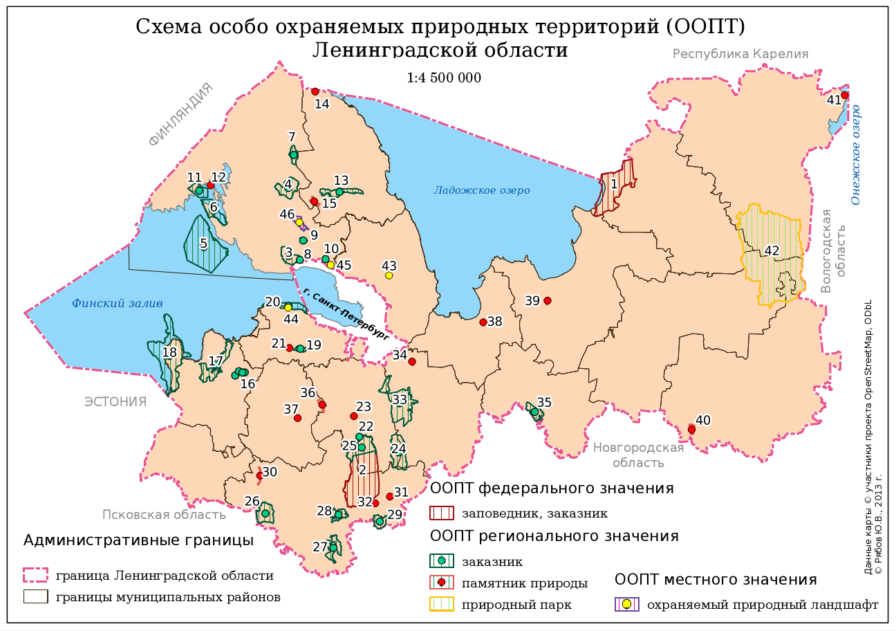
Schema of the Conservation Areas in Leningradskaya Region: Some Notes for Beginner Mappers

Schema of the Conservation Areas in Leningradskaya Region

About a year ago I was asked to create a small (a B5 size) and simple schema of the conservation areas in Leningradskaya region. I did it using QGIS. Here you are the author version of the schema and several notes that might be helpful for a beginner map-maker.

There was a huge disproportion between areas of different objects and both polygon and point markers were needed to show them. I decided to use Centroid Fill option in polygon style to be able to use only one layer (polygon) instead of two (polygon and point). Using Centroid Fill makes points in centres of the small polygons overlap and mask these tiny polygons. 

All the administrative borers were stored in one layer (and there are far more borders than one see here). They are drawn using rule-based symbology so I didn't even need to subset this layer to get rid of the rest of the polygons in this layer.

All the names of the surrounding countries, regions, city and the water bodies are not labels derived from layers, but labels created inside the map composer. It was quicker and their position was more precise which is crucial for such a small schema.

There was a lack of space for the legend so I had to utilise every bit of canvas to place it. I had to use 3 legend items here. One of them is actually overlapping the other and setting a transparent background for the legends was helping with that.

Finally labels for the conservation areas (numbers) were outlined with white colour to be perfectly readable. Some of them were moved manually (with storing coordinates in special columns of the layer) to prevent overlapping with other labels and data.

P.S. Don't be afraid to argue with the client about the workflow. Initially I was asked it manually digitise a 20 000 x 15 000 pixels raster map of the Leningrad region to extract the most precise borders of the conservation areas (and districts of the region). Of course I could do it and charge more money for the job, but what's the point if some of that borders are not even to be seen at this small schema? So I convinced client to use data from OSM and saved myself a lot of time.

Thursday, May 8, 2014

Classification of the Hyper-Spectral and LiDAR Imagery using R (mostly). Part 3: Shadow Removal

This is my third post in this series, here are the links to the Part 1 and Part 2. Sorry for the delay, but at that time I got completely consumed with my PhD thesis and this story just went out of my mind.

To the point. There were 2 types of shadows I had to deal with: cloud shadows and cast shadows (from building and trees). In scientific literature you can find several relatively complicated algorithms to deal with them (including DEM usage for cast shadow detection) and I definitely should have used some of them, but... I was too lazy to implement them when there were couple of quick'n'dirty workarounds available.

Cloud shadow removal

To remove cloud shadows I decided to calculate ratio between mean pixel value of the lighted up and shadowed parts of the raster for each band and multiply shadowed pixels by this ratio.  I manually created a mask for shadowed areas. There were 3 areas and their borders were quite distinct in NIR channels:

Cloud shadows in one of the NIR bands

I drew several polygons over shadows in QGIS and converted them to raster (Raster -> Conversion -> Rasterise). Now everything was ready for patching:

library(raster)
library(rgdal)

# load rasters
image <- stack('2013_IEEE_GRSS_DF_Contest_CASI.tif') # hyper spectral imagery
s_mask <- raster('shadow_mask.tif') # mask for cloud shadow

# extract shadowed area
m_cloud <- s_mask
m_cloud[m_cloud < 1] <- NA
shadowed <- mask(image, m_cloud)

# calculate zonal statistics
zd <- zonal(image, s_mask, fun = 'mean', na.rm = T)
zd <- as.data.frame(zd)

# calculate ratio between lighted up and shadowed zones
zd[3,] <- zd[1,] / zd[2,] 

# recalculae data in shadows
multiplyer <- zd[3,]
multiplyer <- multiplyer[,2:ncol(zd)]
multiplyer <- as.numeric(multiplyer)
enlight <- shadowed*multiplyer # patch layer
restored <- cover(enlight, image, progress = 'text')

# save result
wr <- writeRaster(restored, 
                  filename = 'restored.tif', 
                  datatype = 'GTiff', overwrite = TRUE)


Now it's time to check out results:

The same NIR band after cloud shadow removal
Yes, we can easily find patched areas, but overall result is good for such simple approach.

Cast shadow removal

Shadows from buildings can be processed the same way as cloud shadows as shown above except mask creation approach is different. In case of cast shadows they have to be detected automatically (for there are a bit more than 3 as in case with clouds). Using one of the NIR bands I created a learning sample of points and passed it to Random Forest algorithm to classify imagery into shadowed and non-shadowed areas. I will not describe here this classification process for Random Forest was used for overall classification of the imagery and it is the subject of my next post of this series.

Monday, February 3, 2014

About Corruption and Economical Health of Countries

There is a quite interesting article about the corruption level in EU countries was published at BBC recentely. Of course the map is the most interesting part. 


The thing that I totally noticed in the very first moment of observing it, is that the countries with the highest corruption level have the lowest credit ratings (see this interactive map).


When will all these bastards understand that corruption hurts everyone?

Saturday, August 3, 2013

Classification of the Hyper-Spectral and LiDAR Imagery using R (mostly). Part 2: Classification Approach and Spectre Profile Creation

Introduction

This is the second part of my post series related to hyper-spectral and LiDAR imagery using R. See other parts:

In this part I will describe my general approach to classification process and then I will show you how to create cool spectral response plots like this:
spectral response graph
Colour of boxes corresponds to the band wavelength


Classification approach

I decided to use Random Forest algorithm for the per-pixel classification. Random Forest is a reliable machine-learning algorithm and I already successfully used it for my projects. Notice that the winner of the contest used Random Forest too, but with per-object classification approach.

Random Forest is implemented in R in 'randomForest' package and cool thing is that 'raster' package is able to implement it to rasters. But not only initial 144 hyper-spectral bands + LiDAR were 'feeded' to Random Forest, but in addition several indices and DSM derivatives were used. Here is what I did for classification:
  1. Cloud shadow identification and removal.
  2. Self-casted shadow identification and removal.
  3. Creation of the spectral profiles for the 16 classes. This needed to choose which bands will be used for indices calculation.
  4. Indices calculation: NDVI, NHFD, NDWI.
  5. DSM processing: elevated objects extraction, DSM to DTM conversion, calculation of slope, aspect, normalised DEM, topographic position and terrain roughness indices.
  6. Random Forest model creation and adjustment. Classification itself.
  7. Final filtering using python-GDAL.
  8. Result evaluation.

Spectral profiles

For calculation of indices one need to choose the bands as an input. Which one to pick if there are 144 bands in hyper-spectral image? The spectral profile graphs which should help with that. But these won't be common spectral profiles that we all used to, like this one:
Spectral profile from one of my researches
We need to see dispersion of band values for each class much more than mean values, because dispersion will significantly affect classification. If some classes will have overlapping values in the same band it will decrease accuracy of classification. Ok, at our spectral profile we should see wavelength, band number and dispersion of given classes to make a decision which band to pick for indices calculation. This means that box plots will be used instead of linear plots. Also boxes should be coloured accordingly to the corresponding wavelength

Needed libraries

library(ggplot2)
library(reshape2)
library(raster)
library(rgdal)

Load raster and take samples using .shp-file with classes

# Load raster
image <- stack('~/EEEI_contest/all_layers.tif')

# Load point .shp-file with classes
s_points_dFrame <- readOGR( '~/EEEI_contest',
                    layer="sampling_points",
                    p4s="+proj=utm +zone=15 +datum=NAD83 +units=m +no_defs +ellps=GRS80 +towgs84=0,0,0")
s_points <- SpatialPoints(s_points_dFrame)
dFrame <- as.data.frame(s_points_dFrame)

# Extract data at sampling points
probe <- extract(image, s_points, method='bilinear')

# Combine sampling results with original data 
sample <- cbind(dFrame, probe)

Spectral profile creation

At this point we have 'sample' dataframe that looks like this:
'pattern' is a class name and 'pattern_id' is the integer that corresponds to each class. These fields, as well as 'lat' and 'lon' belonged to the shp-file. Ohter fields were created with 'extract' function.
# get numbers for bands instead of names in headers of columns
for (i in c(7:ncol(sample))){
  colnames(sample)[i] <- i-6
}

Creation of the proper names for bands and palette creation

# preparation for palette creation (establish wavelengths)
palette <- c()
violet <- c(380:450)
blue <- c(452:495)
green <- c(496:570)
yellow <- c(571:590)
orange <- c(591:620)
red <- c(621:750)
NIR <- c(750:1050)

# process band names (future captions) and palette
for (i in c(7:150)){
  # calculate wavelength for a given band
  wave <- (i-7)*4.685315 + 380
  wave <- round(wave, digits = 0)
  
  # rename colunms in 'sample'
  band_num <- paste('(band', i-6, sep = ' ')
  band_num <- paste(band_num, ')', sep = '')
  colnames(sample)[i] <- paste(wave, band_num, sep = ' ')
  
  # add value to palette
  if (is.element(wave, violet)) {palette <- c(palette, '#8F00FF')   
  } else if (is.element(wave, blue)) {palette <- c(palette, '#2554C7')   
  } else if (is.element(wave, green)) {palette <- c(palette, '#008000')   
  } else if (is.element(wave, yellow)) {palette <- c(palette, '#FFFF00')   
  } else if (is.element(wave, orange)) {palette <- c(palette, '#FF8040')   
  } else if (is.element(wave, red)) {palette <- c(palette, '#FF0000')   
  } else if (is.element(wave, NIR)) {palette <- c(palette, '#800000')   
  }
  
}

# Remove unneeded fields
sample <- subset(sample, select = 1:150)
sample[, 5] <- NULL
sample[, 5] <- NULL
sample <- sample[,3:148]
Now our dataframe looks like this:

Reshape dataframe for future plotting:
#
sample <- melt(sample, id = c('pattern', 'pattern_id'))
#
#
Now our dataframe looks like this:

We want to create spectral profiles for each class. This means we need to create plotting function. Keep in mind that 'ggplot2' doesn't work with local variables. We need to create generic plotting function and run it in a cycle that will create global subsets from our dataframe:
plotting <- function(data_f, plot_name){
  p <- ggplot(data_f, aes(data_f[,3], data_f[,4])) +
       geom_boxplot(aes(fill = data_f[,3]),
                    colour = palette,
                    # make outliers have the same colour as lines    
                    outlier.colour = NULL) +
       theme(axis.text.x = element_text(angle=90, hjust = 0),
             axis.title = element_text(face = 'bold', size = 14),
             title = element_text(face = 'bold', size = 16),
             legend.position = 'none') +
       labs(title = paste('Spectral response for class\n',
                          plot_name,
                          sep = ' '),
            x = 'Wavelength, nm',
            y = 'Response')+
       scale_fill_manual(values = palette)
  print(p)
}

Final stage: plotting (EDIT: name of the dataframe was fixed to match previous code parts)
# get unique classes

# uniue class numbers:
u <- unique(sample[,'pattern_id'])
# unique class names:
u_names <- unique(unlist(sample[,'pattern']))

for (i in u){
  # works only if class numbers (u) are consequtive integers from 1 to u
  data_f <- subset(sample, pattern_id == i)  
  plot_name <- u_names[i]
  plotting(data_f, plot_name)
}

If you are curious here you are the rest of the plots:

Sunday, July 28, 2013

Classification of the Hyper-Spectral and LiDAR Imagery using R (mostly). Part 1: Result Evaluation

Introduction

This us the first post of my series notes about hyperspectral imagery classification. See other parts: Part 2: Classification Approach and Spectral Profiles Creation
There was the EEEI Data Fusion Contest this spring. This year they wanted people to elaborate about hyper-spectral (142-bands imagery) and LiDAR data. The resolution of the data-set was about 5 m.  There were 2 nominations: best classification and  the best scientific paper. 

I work with high-resolution imagery quite often, but classification is a very rear task for me though. I thought that this contest was a great opportunity to develop my skills. And not just a classification skills, but R skills as well... I decided to participate in best classification contest, and to use R for the most part. 

I learned a lot and I will share my knowledge with you in a series of posts starting with this one. And like in some great novels, I will start from the very end - evaluation of my results.
Results of my classification (created in R, designed in QGIS)

Contest results

...are available here. As you may notice, I'm not on the list of the 10 best classification ;-) But there is almost unnoticeable 0.03% difference between my result (85.93% accuracy) and the result of the 10-th place. Not a bad result for a relatively inexperienced guy, don't you think? And I know, that I could have done better - I had 99% prediction accuracy for the training samples. It's funny, but my classification map looks better than map that took 7-th place!

How to evaluate classification using R

Due to I was not on the top ten list, I had to evaluate the result on my own. The organisers finally disclosed evaluation samples and I got a chance for a self assessment. So we have a set of .shp-files - each contains ground-truth polygons for one of the 16 classes and a classification map. We need to accomplish 3 goals: 
  1. Create a visual representation of missclassification.
  2. Assess accuracy.
  3. Create a confusion matrix.
  4. Visualise classification map using EEEI colour palette.

Lets get a palette!

Official EEEI palette
To extract colour values from the palette above you may use GIMP. But I used a widget that every KDE-user (Linux) should have by default. You can probe and save colour values from any part of your screen. Quite useful!

'Color picker' in work
Now let's see the code for our tasks.

Load needed libraries

library(rgdal)
library(raster)
library(reshape2)
library(caret)
library(ggplot2)

Load and process data

# get classification raster
ras <- raster('~/GIS/IEEE_contest_2013/2013_IEEE_GRSS_DF_Contest/raster.tif',
              verbose = T)
# get list of shp-files for evaluation
shapes <- list.files(path = '~/GIS/IEEE_contest_2013/2013_IEEE_GRSS_DF_Contest/roi', pattern = '*shp')
# a list for accuracy assessment
accuracy_list <- list()

# create an empty dataframe to be filled vith evaluation results
# field names are not arbitrary!!!
eval_df <- data.frame(variable = character(),
                      value = character())

# create an empty dataframe to be used for plotting
# field names are not arbitrary!!!
plot_data <- data.frame(variable = character(),
                        value = character(),
                        Freq = integer())


for (f_name in shapes) {
  # delete '.shp' from the filename
  layer_name <- paste(sub('.shp', '', f_name))
  class <- readOGR("~/GIS/IEEE_contest_2013/2013_IEEE_GRSS_DF_Contest/roi",
                   layer = layer_name,
                   verbose = F)

  # extract values from raster
  probe <- extract(ras, class)

  # replace class numbers with names 
  samples <- list()
  for (lis in probe) {
    for (value in lis) {
      if (value == 0) {c_name <- Unclassified
      } else if (value == 1) {c_name <- 'Healthy grass'
      } else if (value == 2) {c_name <- 'Stressed grass'
      } else if (value == 3) {c_name <- 'Synthetic grass'
      } else if (value == 4) {c_name <- 'Trees'
      } else if (value == 5) {c_name <- 'Soil'
      } else if (value == 6) {c_name <- 'Water'
      } else if (value == 7) {c_name <- 'Residential'
      } else if (value == 8) {c_name <- 'Commercial'
      } else if (value == 9) {c_name <- 'Road'
      } else if (value == 10) {c_name <- 'Highway'
      } else if (value == 11) {c_name <- 'Railway'
      } else if (value == 12) {c_name <- 'Parking Lot 1'
      } else if (value == 13) {c_name <- 'Parking Lot 2'
      } else if (value == 14) {c_name <- 'Tennis Court'
      } else if (value == 15) {c_name <- 'Running Track'} 
      samples <- c(samples, c = c_name)
    }
  }

  # make layer_name match sample name
  if (layer_name == 'grass_healthy') {layer_name <- 'Healthy grass'
  } else if (layer_name == 'grass_stressed') {layer_name <- 'Stressed grass'
  } else if (layer_name == 'grass_syntethic') {layer_name <- 'Synthetic grass'
  } else if (layer_name == 'tree') {layer_name <- 'Trees'
  } else if (layer_name == 'soil') {layer_name <- 'Soil'
  } else if (layer_name == 'water') {layer_name <- 'Water'
  } else if (layer_name == 'residental') {layer_name <- 'Residential'
  } else if (layer_name == 'commercial') {layer_name <- 'Commercial'
  } else if (layer_name == 'road') {layer_name <- 'Road'
  } else if (layer_name == 'highway') {layer_name <- 'Highway'
  } else if (layer_name == 'railway') {layer_name <- 'Railway'
  } else if (layer_name == 'parking_lot1') {layer_name <- 'Parking Lot 1'
  } else if (layer_name == 'parking_lot2') {layer_name <- 'Parking Lot 2'
  } else if (layer_name == 'tennis_court') {layer_name <- 'Tennis Court'
  } else if (layer_name == 'running_track') {layer_name <- 'Running Track'} 

  # create a dataframe with classification results
  df <- as.data.frame(samples)
  dfm <- melt(df, id = 0)
  dfm['variable'] <- layer_name

  # add data to evaluation dataframe
  eval_df <- rbind(eval_df, dfm)

  # assess accuracy of current class
  mytable <- table(dfm)
  dmt <- as.data.frame(mytable)
  total_samples <- 0
  correct_predictions <- 0
  for (i in 1:nrow(dmt)) {
    predict_class <- toString(dmt[i,2])
    pc_frequency <- dmt[i,3]
    if (predict_class == layer_name) {
      correct_predictions <- dmt[i,3]
    }
    total_samples <- total_samples + pc_frequency
  }
  accuracy <- round(correct_predictions/total_samples, 2)
  accuracy_list <- c(accuracy_list, c = accuracy)


  # append data for plotting
  plot_data <- rbind(plot_data, dmt)
}

Create a fancy graph (that is shown on the map)


# create facets plot
EEEI_palette <- c('#D4D4F6',
                  '#5F5F5F',
                  '#710100',
                  '#00B300',
                  '#007900',
                  '#014400',
                  '#008744',
                  '#D0B183',
                  '#BAB363',
                  '#DAB179',
                  '#737373',
                  '#A7790A',
                  '#00EA01',
                  '#CA1236',
                  '#00B9BB')
plot_data <- plot_data[order(plot_data$variable),]
p = ggplot(data = plot_data,
           aes(x = factor(1),
               y = Freq,
               fill = factor(value)
           )
)
p <- p + facet_grid(facets = . ~ variable)
p <- p + geom_bar(width = 1) +
  xlab('Classes') +
  ylab('Classification rates') +
  guides(fill=guide_legend(title="Classes"))+
  scale_fill_manual(values = EEEI_palette)+
  ggtitle('Classification Accuracy')+
  theme(axis.text.x = element_blank(), axis.ticks.x = element_blank())
p

Let't finally get our accuracy result!


# accuracy assessment
fin_accuracy <- mean(unlist(accuracy_list))
fin_accuracy <- paste(round(fin_accuracy*100, 2), '%', sep = '')
print(paste('Total accuracy:', fin_accuracy), sep = ' ')

[1] "Total accuracy: 85.93%"

Confusion matrix


# confusion matrix creation
true <- as.factor(eval_df$variable)
predict <- as.factor(eval_df$value)
confusionMatrix(predict, true)


Enjoy statistics!
Confusion Matrix and Statistics

                 Reference
Prediction        Commercial Healthy grass Highway Parking Lot 1
  Commercial             850             0      14           151
  Healthy grass            0           868       0             0
  Highway                  0             0     718            14
  Parking Lot 1           41             0      54           641
  Parking Lot 2            0             0      19            73
  Railway                  0             0      11            44
  Residential            155             0     191             0
  Road                     0             0      20           107
  Running Track            0             0       0             0
  Soil                     0             0       1             0
  Stressed grass           0            61       0             0
  Synthetic grass          0             0       0             0
  Tennis Court             0             0       0             0
  Trees                    0           117       0             0
  Water                    0             0       0             0
                 Reference
Prediction        Parking Lot 2 Railway Residential Road Running Track
  Commercial                  0       0          74    2             0
  Healthy grass               0       0           0    0             0
  Highway                     0       9           0    0             0
  Parking Lot 1             104       8           0   11             0
  Parking Lot 2             155       4           0    3             0
  Railway                     2     917          11   61             0
  Residential                 0      40         918    0             0
  Road                       12      14           0  930             0
  Running Track               0       0           1    0           465
  Soil                        6       2           0   27             1
  Stressed grass              0      11           4    0             0
  Synthetic grass             0       0           0    0             3
  Tennis Court                0       3           0    0             0
  Trees                       0       0          10    0             0
  Water                       0       0           0    0             0
                 Reference
Prediction        Soil Stressed grass Synthetic grass Tennis Court Trees
  Commercial         0              0               0            0     0
  Healthy grass      0             14               0            0    34
  Highway            0              0               0            0     0
  Parking Lot 1      0              0               0            0     0
  Parking Lot 2      0              0               0            0     0
  Railway            0              0               0            0     0
  Residential        0              1               0            0     0
  Road              14              0               0            0     0
  Running Track      0              0               0            0     0
  Soil            1040              0               0            0     0
  Stressed grass     0            931               0            0    17
  Synthetic grass    0              0             503            0     0
  Tennis Court       0              0               0          245     0
  Trees              0             85               0            0  1004
  Water              0              0               0            0     0
                 Reference
Prediction        Water
  Commercial          0
  Healthy grass       3
  Highway             0
  Parking Lot 1      22
  Parking Lot 2       0
  Railway             0
  Residential         0
  Road                0
  Running Track       0
  Soil                0
  Stressed grass      0
  Synthetic grass     0
  Tennis Court        0
  Trees               0
  Water             118

Overall Statistics

               Accuracy : 0.859         
                 95% CI : (0.853, 0.866)
    No Information Rate : 0.088         
    P-Value [Acc > NIR] : <2e-16        

                  Kappa : 0.847         
 Mcnemar's Test P-Value : NA            

Statistics by Class:

                     Class: Commercial Class: Healthy grass Class: Highway
Sensitivity                     0.8126               0.8298         0.6984
Specificity                     0.9780               0.9953         0.9979
Pos Pred Value                  0.7791               0.9445         0.9690
Neg Pred Value                  0.9820               0.9839         0.9724
Prevalence                      0.0872               0.0872         0.0857
Detection Rate                  0.0709               0.0724         0.0599
Detection Prevalence            0.0910               0.0767         0.0618
                     Class: Parking Lot 1 Class: Parking Lot 2
Sensitivity                        0.6223               0.5556
Specificity                        0.9781               0.9915
Pos Pred Value                     0.7276               0.6102
Neg Pred Value                     0.9650               0.9894
Prevalence                         0.0859               0.0233
Detection Rate                     0.0535               0.0129
Detection Prevalence               0.0735               0.0212
                     Class: Railway Class: Residential Class: Road
Sensitivity                  0.9097             0.9018      0.8994
Specificity                  0.9883             0.9647      0.9848
Pos Pred Value               0.8767             0.7034      0.8478
Neg Pred Value               0.9917             0.9906      0.9905
Prevalence                   0.0841             0.0849      0.0862
Detection Rate               0.0765             0.0766      0.0776
Detection Prevalence         0.0872             0.1088      0.0915
                     Class: Running Track Class: Soil
Sensitivity                        0.9915      0.9867
Specificity                        0.9999      0.9966
Pos Pred Value                     0.9979      0.9656
Neg Pred Value                     0.9997      0.9987
Prevalence                         0.0391      0.0879
Detection Rate                     0.0388      0.0867
Detection Prevalence               0.0389      0.0898
                     Class: Stressed grass Class: Synthetic grass
Sensitivity                         0.9030                 1.0000
Specificity                         0.9915                 0.9997
Pos Pred Value                      0.9092                 0.9941
Neg Pred Value                      0.9909                 1.0000
Prevalence                          0.0860                 0.0420
Detection Rate                      0.0777                 0.0420
Detection Prevalence                0.0854                 0.0422
                     Class: Tennis Court Class: Trees Class: Water
Sensitivity                       1.0000       0.9517      0.82517
Specificity                       0.9997       0.9806      1.00000
Pos Pred Value                    0.9879       0.8257      1.00000
Neg Pred Value                    1.0000       0.9953      0.99789
Prevalence                        0.0204       0.0880      0.01193
Detection Rate                    0.0204       0.0837      0.00984
Detection Prevalence              0.0207       0.1014      0.00984

As you may see, the main source of misclassification are Parking Lot 1 and Parking Lot 2. The accuracy for other classes is above 90%, and it is great. Frankly, I still don't understand what is the difference between Parking Lots 1  and 2... Official answer was that Parking Lot 2 is cars (isn't detecting them using 5 m resolution imagery is a questionable task???)... But it seems that it is something else. It is hard to classify something that you don't understand what it is...

Thursday, July 25, 2013

A Note About proj4 in R

It's been a long time since I had to transform some coordinates 'manually'. I mean I had a list of coordinates that I needed to [re]project. There are some nice proprietary tools for it, but who needs them when the opensource is everywhere?

Proj4 is an obvious tool for this task. And using it from within R is somewhat a natural approach when you need to process a csv-file. There is a package called... 'proj4' that provides a simple interface to proj4. It has only two functions: project and ptransform. The first one is meant to provide transition between unprojected and projected coordinate reference systems and the second - between different projected coordinate reference systems.

Look closely at description of the project function: "Projection of lat/long coordinates or its inverse". Ok... here is a huge setup which made me write this post. If you would try to use coordinates in lat/long format here you would screw up! Your points would fly thousands of miles away from initial position. Actually you have to use coordinates in long/lat format to get the result you need. Don't trust manuals ;-)

Oh, I really hate the guy who started this practice of placing longitude before latitude in GIS...

Thursday, March 7, 2013

DSM to DEM Conversion

Often you may have some Digital Surface Model (DSM) acquired from a LiDAR data, and you may desire to get rid of buildings and trees in order to get a DEM. There can be found some articles on a subject that would provide more accurate result then that described here. But I will show here my quick-n-dirty way when one don't need extreme accuracy. It is meant to be used for a relatively flat urban areas.

There will be 3 steps:
  1. Subtraction of the elevated objects like buildings and trees from DSM.
  2. Filling the gaps of the raster cleaned of the elevated objects.
  3. Polishing the DEM.
FOSS software you will need: SAGA GIS, QGIS.

Initial DSM (LiDAR)

Sunday, October 21, 2012

Fire Dynamics In Leningrad Region in 2006

Today I decided to play with TimeManager plugin for QGIS that was introduced by underdark some time ago. After some search across my spatial storage I found only one dataset that contained timestamps: FIRMS fire data that I used for creation of a methodology for burn-out probability calculation (for illegal dumping environmental risk assessment) and for assessment of human influence on fire starting.


Seems that TimeManager is not quite stable after the certain number of features in layer. At least on my machine it crushed several times (during slider manipulation) on the whole dataset of about 7000 points but worked just fine with its one-year subset of about 2700 points. But anyway overall impression is very good.

The main issue was to create a video from the generated .png files. I used console ffmpeg utils. Simple command:
:~>  ffmpeg -r 1/1 -i frame%03d.PNG -vcodec yuv420p -video_size 1126x560 output.flv
produced a 3-minute video above. One second corresponds to 1 day of the most  flammable year for the Leninngrad region in a decade. Video covers period from April to November 2006. I was too lazy to create custom undercover and just loaded OSM via OpenLayers plugin)))

Sunday, September 2, 2012

Raster Extent Modification Using QGIS

UPDATE: you can download script for Processing module to perform this task from here.

When you need to perform algebraic operations with two or more rasters you often have to ensure that these rasters have the same extent, otherwise the operation either  won't be allowed (in SAGA for example) or you will get output raster cropped to the overlapping part. With regular (not georeferenced) images you can simply load them in GIMP and increase or decrease canvas for amount of pixels you like. But in case of georeferenced images you will loose spatial reference information. 

In QGIS you can change extent of the rasters. Lets examine one of the worst case scenarios. There are two overlapping (one band) rasters A and B. Say, we need to add A values to B values and get the final image to have extent that will contain both images.

Overlapping rasters
We will use QGIS's Raster calculator. Firstly we need to create an empty georeferenced image with needed extent. Go to Raster -> Miscellaneous -> Build Virtual Raster. Here choose rasters A and B to become a virtual raster (VR) and do not define noData values. Add VR to the TOC.

Now we will create a templates for expanded A and B. In Raster calculator (Raster -> Raster calculator) insert expression: VR@1 * 0, highlight VR raster (by clicking on it) in Raster bands and click on Current layer extent button. Execute expression and save its result - it will be a template for raster A. Copy it to create template for raster B.

Now lets change extent for A. In Raster calculator enter expression:  A@1 this will simply leave A values unchanged. Then click on VR raster in Raster bands to highlight it and click a on Current layer extent button - this will set desired extent of the output raster. Save result as a template for A (overwrite existing file). Do the same for B.

Now you have both A and B with the same extent and can freely perform calculations over them.

Wednesday, August 1, 2012

Sverdlovskaya Region, Russia: a Field Survey in Autumn. Part 2: Scars on the Earth

Ok, it's time to finish the story about land monitoring in Sverdlovskaya region. In this post I would like to demonstrate some of the most unpleasant types of the land use.

Lets begin with illegal dumping. This dump (note that there is the smoke from waste burning down) is located right next to the potato field (mmm... seems these  potato are tasty). The ground was intentionally excavated here for dumping waste. Obviously this dump is exploited by the agricultural firm - owner of this land, but who cares...
Panorama of freshly burnt illegal dump

The next stop is peat cutting. A huge biotops are destroyed for no good reason (I can't agree that use of peat as an energy source is a good one). At the picture below you can see a peat cutting with the area of 1402 ha. There are dozen of them in the study area...
Peat Cutting (RapidEye, natural colours)
But the most ugly scars on the Earth surface are left from mining works. There is Asbestos town in Sverdlovskaya region. It was names after asbestos that is mined  there. The quarry has an area of 1470 ha and its depth is over 400 meters. Its slag-heaps covers another 2500 ha... The irony is that this quarry gives a job for this town and killing it. You see, if you wand to dig dipper you have to make quarry wider accordingly. Current depth is 450 m and in projects it is over 900 m, but the quarry is already next to the living buildings. So quarry is going to consume the town... By the way, the local cemetery was already consumed. Guess what happened to human remains? Well, it is Russia, so they were dumped into the nearest slug-heap.

Here is the panorama of the quarry. You may try to locate BelAZ trucks down there ;-)
Asbestos quarry
Here is the part of the biggest slag-heap:
A slag-heap
That's how it looks from space:
Asbestos town area (imagery - RapidEye, NIR-G-B pseudo-colour composition)
And in the end I will show you the very basic schema of disturbed land in the study area (no settlements or roads included). Terrifying isn't it? 

Basic schema of disturbed land