Introduction
This is the second part of my post series related to hyper-spectral and LiDAR imagery using R. See other parts:
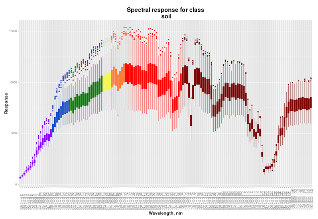
In this part I will describe my general approach to classification process and then I will show you how to create cool spectral response plots like this:
 |
| Colour of boxes corresponds to the band wavelength |
Classification approach
I decided to use
Random Forest algorithm for the per-pixel classification. Random Forest is a reliable machine-learning algorithm and I already successfully used it for my projects. Notice that the winner of the contest used Random Forest too, but with per-object classification approach.
Random Forest is implemented in R in '
randomForest' package and cool thing is that '
raster' package is able to implement it to rasters. But not only initial 144 hyper-spectral bands + LiDAR were 'feeded' to Random Forest, but in addition several indices and DSM derivatives were used. Here is what I did for classification:
- Cloud shadow identification and removal.
- Self-casted shadow identification and removal.
- Creation of the spectral profiles for the 16 classes. This needed to choose which bands will be used for indices calculation.
- Indices calculation: NDVI, NHFD, NDWI.
- DSM processing: elevated objects extraction, DSM to DTM conversion, calculation of slope, aspect, normalised DEM, topographic position and terrain roughness indices.
- Random Forest model creation and adjustment. Classification itself.
- Final filtering using python-GDAL.
- Result evaluation.
Spectral profiles
For calculation of indices one need to choose the bands as an input. Which one to pick if there are 144 bands in hyper-spectral image? The spectral profile graphs which should help with that. But these won't be common spectral profiles that we all used to, like this one:
We need to see dispersion of band values for each class much more than mean values, because dispersion will significantly affect classification. If some classes will have overlapping values in the same band it will decrease accuracy of classification. Ok, at our spectral profile we should see wavelength, band number and dispersion of given classes to make a decision which band to pick for indices calculation. This means that box plots will be used instead of linear plots. Also boxes should be coloured accordingly to the corresponding wavelength
Needed libraries
library(ggplot2)
library(reshape2)
library(raster)
library(rgdal)
Load raster and take samples using .shp-file with classes
# Load raster
image <- stack('~/EEEI_contest/all_layers.tif')

# Load point .shp-file with classes
s_points_dFrame <- readOGR( '~/EEEI_contest',
                    layer="sampling_points",
                    p4s="+proj=utm +zone=15 +datum=NAD83 +units=m +no_defs +ellps=GRS80 +towgs84=0,0,0")
s_points <- SpatialPoints(s_points_dFrame)
dFrame <- as.data.frame(s_points_dFrame)

# Extract data at sampling points
probe <- extract(image, s_points, method='bilinear')

# Combine sampling results with original data
sample <- cbind(dFrame, probe)
Spectral profile creation
At this point we have 'sample' dataframe that looks like this:
'pattern' is a class name and 'pattern_id' is the integer that corresponds to each class. These fields, as well as 'lat' and 'lon' belonged to the shp-file. Ohter fields were created with 'extract' function.
# get numbers for bands instead of names in headers of columns
for (i in c(7:ncol(sample))){
  colnames(sample)[i] <- i-6
}
Creation of the proper names for bands and palette creation
# preparation for palette creation (establish wavelengths)
palette <- c()
violet <- c(380:450)
blue <- c(452:495)
green <- c(496:570)
yellow <- c(571:590)
orange <- c(591:620)
red <- c(621:750)
NIR <- c(750:1050)

# process band names (future captions) and palette
for (i in c(7:150)){
  # calculate wavelength for a given band
  wave <- (i-7)*4.685315 + 380
  wave <- round(wave, digits = 0)

  # rename colunms in 'sample'
  band_num <- paste('(band', i-6, sep = ' ')
  band_num <- paste(band_num, ')', sep = '')
  colnames(sample)[i] <- paste(wave, band_num, sep = ' ')

  # add value to palette
  if (is.element(wave, violet)) {palette <- c(palette, '#8F00FF')
  } else if (is.element(wave, blue)) {palette <- c(palette, '#2554C7')
  } else if (is.element(wave, green)) {palette <- c(palette, '#008000')
  } else if (is.element(wave, yellow)) {palette <- c(palette, '#FFFF00')
  } else if (is.element(wave, orange)) {palette <- c(palette, '#FF8040')
  } else if (is.element(wave, red)) {palette <- c(palette, '#FF0000')
  } else if (is.element(wave, NIR)) {palette <- c(palette, '#800000')
  }

}

# Remove unneeded fields
sample <- subset(sample, select = 1:150)
sample[, 5] <- NULL
sample[, 5] <- NULL
sample <- sample[,3:148]
Now our dataframe looks like this:
Reshape dataframe for future plotting:
#
sample <- melt(sample, id = c('pattern', 'pattern_id'))
#
#
Now our dataframe looks like this:
We want to create spectral profiles for each class. This means we need to create plotting function. Keep in mind that 'ggplot2' doesn't work with local variables. We need to create generic plotting function and run it in a cycle that will create global subsets from our dataframe:
plotting <- function(data_f, plot_name){
  p <- ggplot(data_f, aes(data_f[,3], data_f[,4])) +
       geom_boxplot(aes(fill = data_f[,3]),
                    colour = palette,
                    # make outliers have the same colour as lines
                    outlier.colour = NULL) +
       theme(axis.text.x = element_text(angle=90, hjust = 0),
             axis.title = element_text(face = 'bold', size = 14),
             title = element_text(face = 'bold', size = 16),
             legend.position = 'none') +
       labs(title = paste('Spectral response for class\n',
                          plot_name,
                          sep = ' '),
            x = 'Wavelength, nm',
            y = 'Response')+
       scale_fill_manual(values = palette)
  print(p)
}
Final stage: plotting
(EDIT: name of the dataframe was fixed to match previous code parts)
# get unique classes

# uniue class numbers:
u <- unique(sample[,'pattern_id'])
# unique class names:
u_names <- unique(unlist(sample[,'pattern']))

for (i in u){
  # works only if class numbers (u) are consequtive integers from 1 to u
  data_f <- subset(sample, pattern_id == i)
  plot_name <- u_names[i]
  plotting(data_f, plot_name)
}
If you are curious here you are the rest of the plots:


