 |
| Schema of the Conservation Areas in Leningradskaya Region |
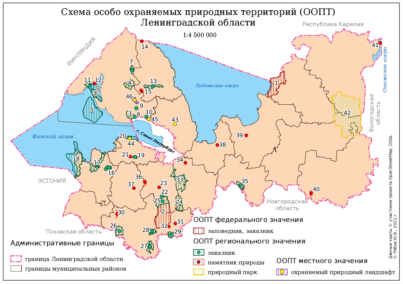
About a year ago I was asked to create a small (a B5 size) and simple schema of the conservation areas in Leningradskaya region. I did it using QGIS. Here you are the author version of the schema and several notes that might be helpful for a beginner map-maker.
There was a huge disproportion between areas of different objects and both polygon and point markers were needed to show them. I decided to use Centroid Fill option in polygon style to be able to use only one layer (polygon) instead of two (polygon and point). Using Centroid Fill makes points in centres of the small polygons overlap and mask these tiny polygons.
All the administrative borers were stored in one layer (and there are far more borders than one see here). They are drawn using rule-based symbology so I didn't even need to subset this layer to get rid of the rest of the polygons in this layer.
All the names of the surrounding countries, regions, city and the water bodies are not labels derived from layers, but labels created inside the map composer. It was quicker and their position was more precise which is crucial for such a small schema.
There was a lack of space for the legend so I had to utilise every bit of canvas to place it. I had to use 3 legend items here. One of them is actually overlapping the other and setting a transparent background for the legends was helping with that.
Finally labels for the conservation areas (numbers) were outlined with white colour to be perfectly readable. Some of them were moved manually (with storing coordinates in special columns of the layer) to prevent overlapping with other labels and data.
P.S. Don't be afraid to argue with the client about the workflow. Initially I was asked it manually digitise a 20 000 x 15 000 pixels raster map of the Leningrad region to extract the most precise borders of the conservation areas (and districts of the region). Of course I could do it and charge more money for the job, but what's the point if some of that borders are not even to be seen at this small schema? So I convinced client to use data from OSM and saved myself a lot of time.

